
Shopping online for technically complex products confronts users with a multitude of issues. Based on initial research, users were hesitant to buy technical products online without doing research and understanding their purchase. What is the deciding factor for users to click on a product from a product list? How can we increase overall customer confidence in finding and purchasing the correct technical product?
Increase user confidence by refining language, layout and feature communication as well as offering a simplified solution for multiple types of products.
Company: Owens Corning, Fortune 500
Role: Lead Strategist & Designer
Tools: Figma, UserTesting.com, Confluence (documentation)
I began this project by establishing our baseline for current user experience on the site based on user session recordings and heat maps from HotJar as well as data from Adobe Analytics where I analyzed user journeys from the last year across multiple product listing pages, all for technical products like insulation or composites.
User research revealed several critical issues with the product listing pages. High bounce rates indicated that users were leaving the site without meaningful engagement, and low click-through rates suggested difficulty in finding relevant details. Additionally, the filtering system was unintuitive, leading to underutilization and frustration. Many users experienced cognitive overload due to excessive information, and a lack of clear visual hierarchy made it difficult to scan product details quickly. These barriers prevented users from effectively navigating the product listings and making informed purchasing decisions.
Key Challenges:
Using usability tests, heatmaps, and user surveys, we identified key pain points: excessive cognitive load, poor visual hierarchy, and an inefficient filtering system. Users expressed frustration over the overwhelming amount of information displayed on the page. Important details like pricing and product ratings were not easily scannable, causing hesitation and disengagement. Additionally, the filtering options were confusing, making it difficult for users to refine their searches effectively. These insights shaped our approach to improving the user experience.
Key Pain Points:
In addition, I worked with marketing and product leaders to confirm the direction of the project and what features they would like to see as well as any requests they may have.
Based on initial design research, we wanted to test how users would respond to different layouts of information as well as what is more important to them when looking for specific products or businesses. As Owens Corning had many other types of lists including professionals such as roofing contractors or sales people as well as the option for single-SKU or multi-SKU products. Due to this level of complication, we created designs of each kind of listing with A/B tests for each.
All of this forethought and strategy allowed us the ability to conceive updated ideas without being hindered by past branding standards. It gave us a great jumping off point for creating react components that would be used across the site for different reasons including professional listings of businesses, sales individuals and other products with different technical needs.
Utilizing UserTesting.com, I conducted 24 interviews with homeowners. Initial findings were as follows:
After a 4-week testing period, the optimized product listing pages yielded substantial improvements. The click-through rate to product pages increased by 12%, indicating greater user interest and engagement. Bounce rates decreased by 8%, demonstrating that users were finding the content more relevant and accessible. Additionally, filter usage increased by 15%, validating the enhancements made to the filtering system. These results confirmed that refining the visual hierarchy and simplifying navigation led to a more effective and user-friendly browsing experience.
Key Metrics
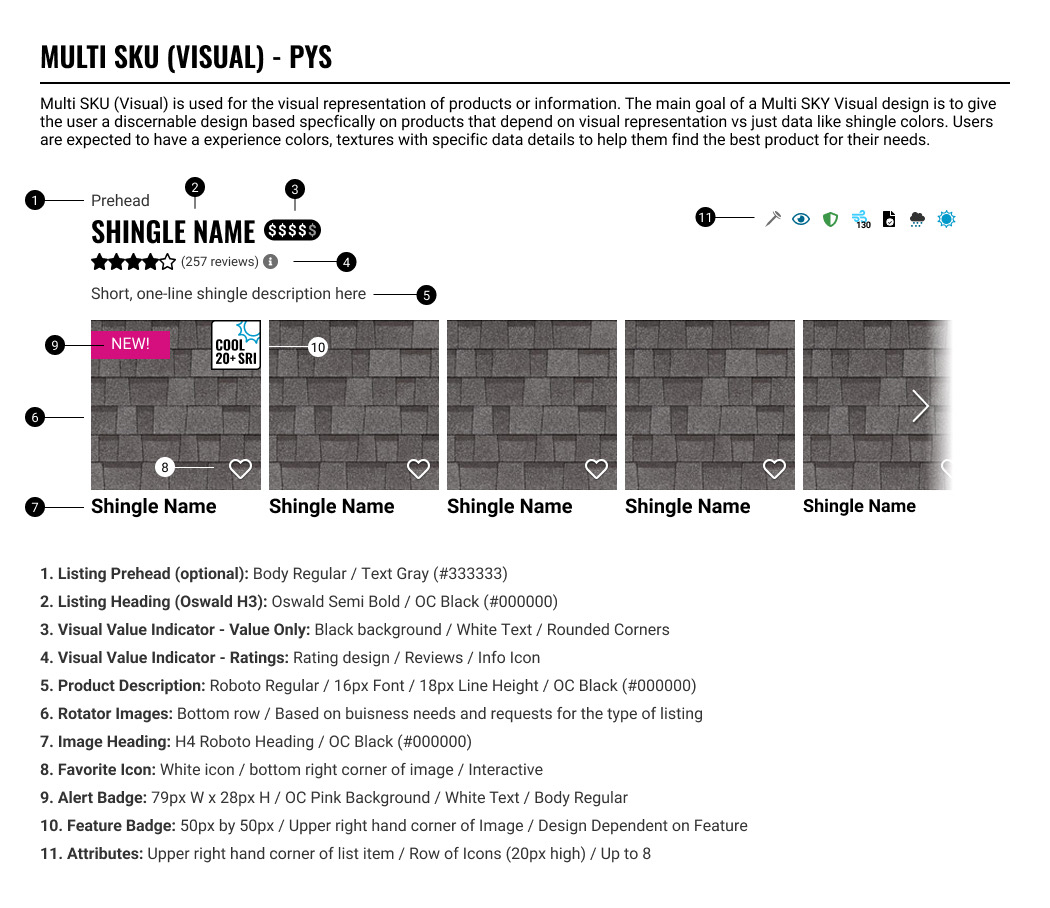
After the 4 weeks of multiple testing rounds and iterations, here are the final designs that were landed upon after review and edits from the development and product teams.


A data-driven approach proved to be essential in guiding design decisions and ensuring meaningful UX improvements. Prioritizing clarity and essential information enhanced user engagement, making product details more digestible and actionable. Furthermore, simplifying and refining the filtering system boosted usability, leading to increased adoption and improved overall site navigation.
Takeaways:
Building on these findings, the next phase of optimization will focus on integrating micro-interactions and personalization to further enhance the shopping experience. By tailoring product listings based on user behavior and preferences, we aim to drive even higher engagement and conversion rates.
Future Enhancements:


